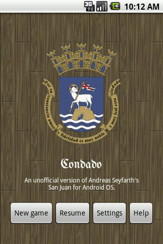
When I wrote Condado, I hardcoded the orientation to portrait mode, mostly because it reduced the variables that I had to work with when it came to laying out items on the screen. So for a long time it only worked this way:

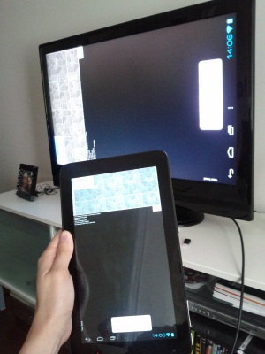
Which was perfectly fine when most people have phones, but now there are a lot of tablets out in the world and people end up playing Condado like this:

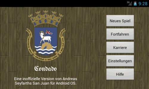
Which is not so great. Redesigning a layout hasn’t been at the top of my priority for awhile, but I figure it’s time to do it now (along with making things size better on larger devices). I’ve started on splash screen first and really like how it turned out.

(btw some people volunteered to translate Condado in French and German so now you can play in those languages too!)
I’ve been having a problem recently because there are too many buttons on the screen so they don’t fit horizontally. I’ve resorted to make them scroll in a row, which doesn’t look very good. But if I lay them out vertically, they have more than enough space. It almost makes me want to make the default layout landscape!
 Hi! and welcome to the eclectic personal blog of Kevin Quan. Come in, stay awhile, peek into the nooks & crannies, and learn a bit about me and my interests.