Through a couple of forum threads, the Android market reviews and email, I’ve received some comments about Condado. I was able to group a couple of them together and solve them:
- Difficult to swipe across boards on high resolution devices
- High resolution devices could show a mini view of your opponents board
- Score text is too small
Plus I was already unhappy with how I put the game scores into a small corner at the edge of the board – although I didn’t really see an alternative because there was not much space left in the UI to put this information. I wanted to put more information there (such as deck and discard information) but had to make some tradeoffs like using acronyms and removing spaces. Basically not a good solution.
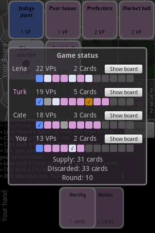
I finally solved it by adding a popup. I still have each players’ scores in the bottom right, but now if you touch it, you will get a popup with more detailed information.

I also fit a row of each players’ board on the popup. You can see what types of buildings they have and whether they have produced a good or not. If you want to see what the buildings actually are, there is now a shortcut button to bring the board into view.
It actually looks quite nice, because the squares with rounded corners bring a nice contrast to the slate theme.
 Hi! and welcome to the eclectic personal blog of Kevin Quan. Come in, stay awhile, peek into the nooks & crannies, and learn a bit about me and my interests.